YOUR GRAPHING TOOLKIT
How to graph
New to line, scatter, and pie graphs? Open the guided Graph Workshop →
Pick your graph type. Open its crayon organizer, follow the steps, or watch a short video. Every video is under 3 minutes and opens in a new tab so your table stays here.
The written steps work even if you cannot watch YouTube.
Bar graphCompare categories.
How to make a bar graph
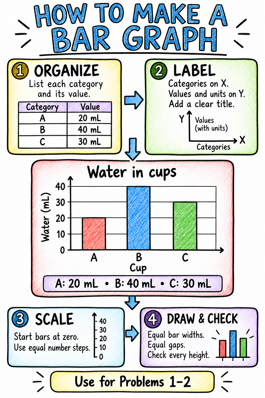
Bar Graphs Review — open the interactive workshop →
Follow the steps
- Organize. List each category and its value in your table.
- Label. Put categories on the horizontal (X) axis and values on the vertical (Y) axis. Copy the units from your table and add a clear title.
- Scale. Start the bars at zero. Choose equal number steps that fit your largest value.
- Draw and check. Draw bars with equal widths and equal gaps. Check each height against your table.
Example in the organizer. Water in cups: A = 20 mL, B = 40 mL, C = 30 mL. The example uses a vertical scale of 0, 10, 20, 30, 40 mL and three separate bars. These are fictional examples.
Watch a quick example · 1:07
Creating a bar chart — Khan Academy (YouTube, new tab)Watch how category values become bar heights. Then use the organizer to add your own title, axes, units, and scale.
Line graphShow change over time.
How to make a line graph
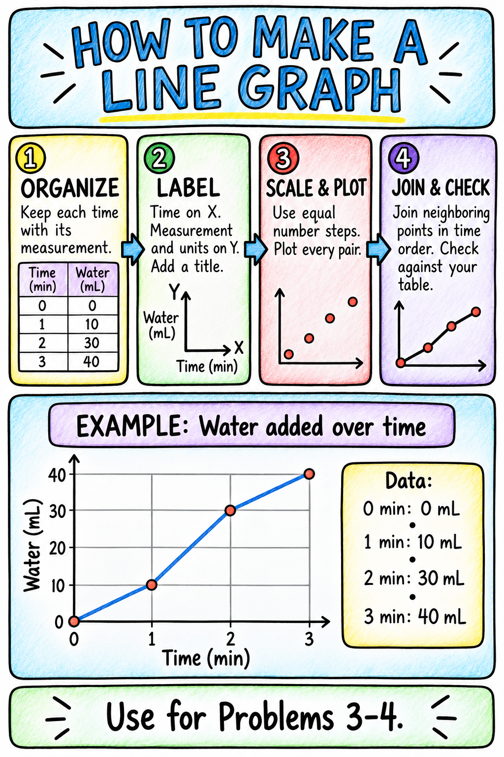
Follow the steps
- Organize. Keep each time with its measurement. Put the rows in time order.
- Label. Put time on the horizontal (X) axis and the measurement on the vertical (Y) axis. Include units and a title.
- Scale and plot. Use equal number steps on each axis. Each axis can have a different scale. Plot every pair by moving across to the time, then up to its measurement.
- Join and check. Use a ruler to join neighboring points in time order. Check every point against the table. Only include (0, 0) if your data include it.
Example in the organizer. Water added over time: (0 min, 0 mL), (1 min, 10 mL), (2 min, 30 mL), (3 min, 40 mL). The example joins these four points in time order. These are fictional examples.
Watch a quick example · 2:36
How to draw a Line Graph — Mr Gedge’s Geography Channel (YouTube, new tab)Follow a population-over-time example, then use the units and measurements in your own problem.
Scatter plotLook for a relationship between two measurements.
How to make a scatter plot
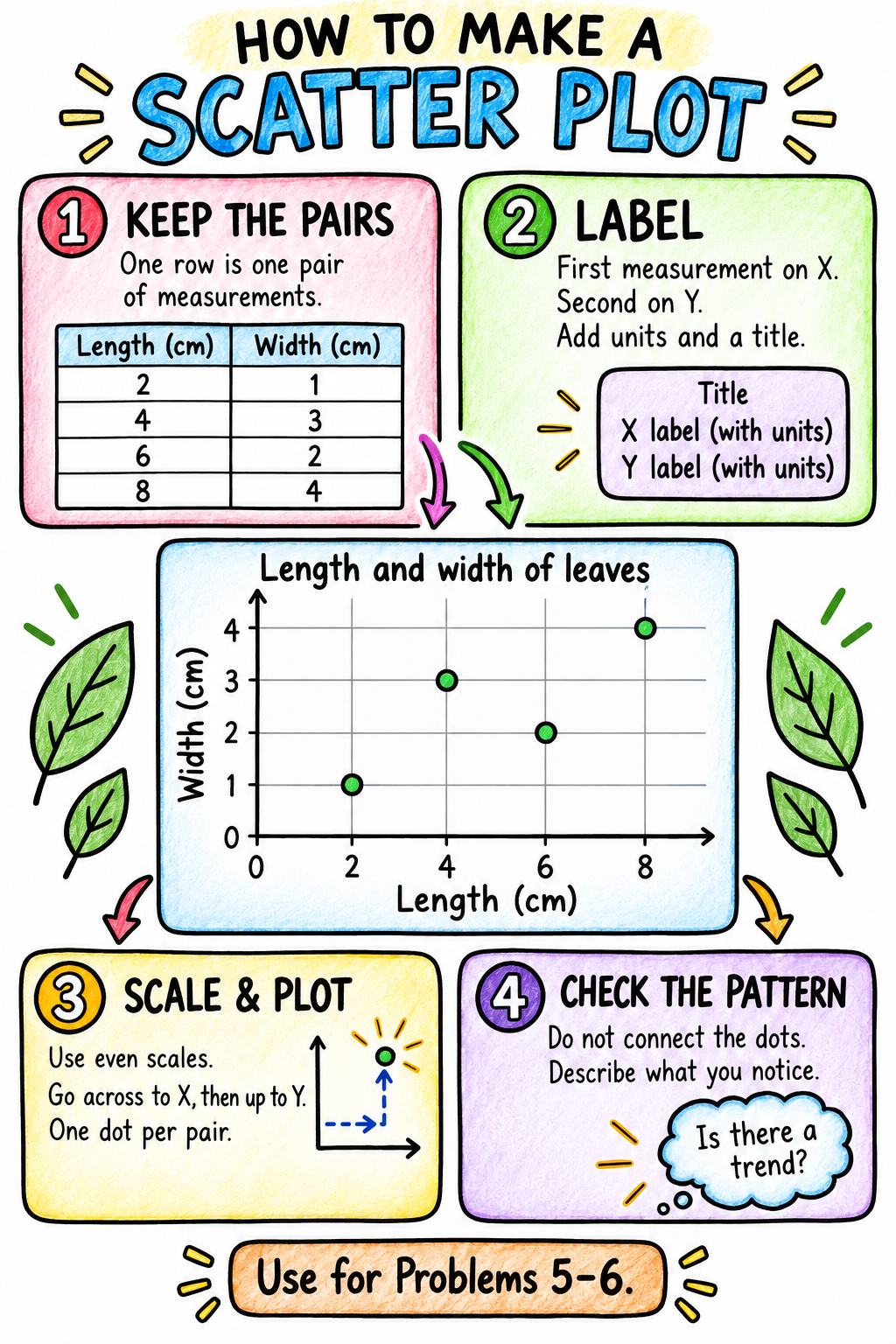
Follow the steps
- Keep the pairs. One row is one pair of measurements. Keep the two values from each row together.
- Label. For these problems, put the first measurement on the horizontal (X) axis and the second on the vertical (Y) axis. Include units and a title.
- Scale and plot. Use an even scale on each axis that fits the data. Go across to X, then up to Y. Draw one dot for each pair.
- Check the pattern. Do not connect the dots. Check every pair, then describe whether the points tend upward, downward, or show no clear pattern. A pattern alone does not prove a cause.
Example in the organizer. Length and width of leaves, both in cm: (2, 1), (4, 3), (6, 2), (8, 4). The example has four separate dots, with length on X and width on Y. These are fictional examples.
Watch a quick example · 2:31
Constructing a scatter plot — Khan Academy (YouTube, new tab)Watch how each row becomes one point. Leave your own scatter-plot dots unconnected.
Pie graphShow parts of one whole.
How to make a pie graph
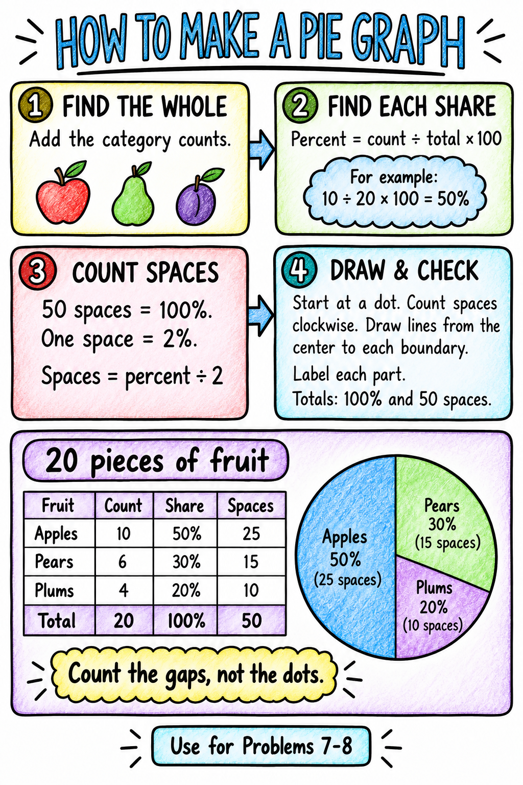
Follow the steps
- Find the whole. Add the category counts to find the total.
- Find each share. For each category: percent = count ÷ total × 100. All the percentages should add to 100%.
- Count spaces. On your 50-dot circle, there are 50 spaces between neighboring dots. Each space is 2%. Spaces = percent ÷ 2. For example, 20% uses 10 spaces.
- Draw and check. Draw a starting line from the center to a dot. Count that category’s spaces clockwise, then draw a line from the center to the new boundary. Start the next category at that boundary and continue around. Count gaps, not dots. Add a title, category labels and percentages; check for 100% and 50 spaces in total.
Example in the organizer. 20 pieces of fruit: 10 apples = 50% = 25 spaces; 6 pears = 30% = 15 spaces; 4 plums = 20% = 10 spaces. Together: 20 pieces, 100%, 50 spaces. These are fictional examples.
Watch a quick example · 1:36
How to draw a pie chart that actually gets full marks — Medly (YouTube, new tab)This video measures slices with a protractor. For our activity, use the 50-dot organizer instead: percent ÷ 2 gives the spaces to count. No protractor needed.
Jump to more graphing practice (Problems 9–16) →
1. Which paper towel holds the most?
Bar graph · How to make this graph
Maya tests four brands of paper towel. She uses one equal-sized piece of each brand, adds water until it cannot hold any more, and measures the water held. In this practice test, brand A holds 18 mL, brand B holds 26 mL, brand C holds 22 mL, and brand D holds 30 mL. Organize the results by brand.
| Paper towel brand | Water held |
|---|---|
Make your graph. Put brand on the x-axis and water held (mL) on the y-axis. Begin the number scale at zero. Leave equal spaces between bars.
Calculate and explain. How many more mL did brand D hold than brand A? Show your work. Why would Maya need more trials before choosing a brand?
2. Which seeds sprouted?
Bar graph · How to make this graph
A science team puts 20 seeds of each kind in four labeled trays. The trays receive the same amount of water and light. After seven days, 14 bean seeds, 18 radish seeds, 12 pea seeds, and 16 sunflower seeds have sprouted. Count a seed only if a root is visible. Organize the number sprouted for each kind.
| Seed kind | Number sprouted |
|---|---|
Make your graph. Put seed kind on the x-axis and number sprouted on the y-axis. Begin at zero and leave equal spaces between bars.
Calculate and explain. What is the difference between the largest and smallest sprout counts? Show your work. Why is starting with 20 of each kind useful?
3. A seedling reaches upward
Line graph · How to make this graph
Leo measures the same seedling from the soil surface to its tip every two days. On day 0 it is 2 cm tall. On day 2 it is 3 cm, on day 4 it is 5 cm, on day 6 it is 7 cm, on day 8 it is 8 cm, and on day 10 it is 10 cm. Organize the measurements in time order.
| Time | Seedling height |
|---|---|
Make your graph. Put time (days) on the x-axis and height (cm) on the y-axis. Use equal number intervals. Plot and connect consecutive measurements.
Calculate and explain. How much taller is the seedling on day 10 than on day 0? Show your work. Did it grow by the same amount in every two-day interval? Use numbers.
4. Warm water cools
Line graph · How to make this graph
A teacher records the temperature of a cup of warm water every two minutes. At minute 0 the water is 60 degrees Celsius. At minute 2 it is 54 degrees, at minute 4 it is 50 degrees, at minute 6 it is 46 degrees, at minute 8 it is 42 degrees, and at minute 10 it is 40 degrees. All temperatures are in degrees Celsius. Organize the record in time order.
| Time | Water temperature |
|---|---|
Make your graph. Put time (min) on the x-axis and temperature (degrees Celsius) on the y-axis. Plot and connect consecutive measurements. Include all six readings.
Calculate and explain. What is the total temperature drop over 10 minutes? Show your work. Which two-minute interval has the largest drop, and how large is it?
5. Ramp height and rolling distance
Scatter plot · How to make this graph
Jules releases the same toy car without pushing from the top of a ramp. Each trial pairs the ramp height with the distance the car travels on the floor after leaving the ramp. A height of 5 cm gives a distance of 20 cm; 10 cm gives 35 cm; 15 cm gives 45 cm; 20 cm gives 40 cm; 25 cm gives 60 cm; and 30 cm gives 70 cm. Keep each height and distance together.
| Ramp height | Floor distance |
|---|---|
Make your graph. Put ramp height (cm) on the x-axis and floor distance (cm) on the y-axis. Plot one dot per pair. Do not connect the dots.
Calculate and explain. From a 15 cm ramp to a 20 cm ramp, how much did floor distance change? Show your work. Describe the overall pattern and the exception.
6. Shade and soil temperature
Scatter plot · How to make this graph
At noon, a class measures six garden spots. Each pair gives the percent of ground covered by shade and the soil temperature in degrees Celsius: 10% shade and 34 degrees; 25% and 30 degrees; 40% and 29 degrees; 55% and 26 degrees; 70% and 23 degrees; 85% and 24 degrees. The spots may also differ in soil moisture. Keep each shade value with its temperature.
| Shade cover | Soil temperature |
|---|---|
Make your graph. Put shade cover (%) on the x-axis and soil temperature (degrees Celsius) on the y-axis. Plot one dot per spot. Do not connect the dots.
Calculate and explain. How much cooler is the 70% shade spot than the 10% spot? Show your work. Describe the overall pattern. Does this comparison alone prove shade caused it?
7. What's in the rock collection?
Pie graph · How to make this graph
A geology club sorts a collection of exactly 50 rocks. They identify 20 as basalt, 15 as granite, 10 as sandstone, and 5 as marble. Each rock belongs to exactly one of these categories. The club wants a circle graph showing how much of the entire collection each rock type represents. Fill the table, including the total row.
| Rock type | Count | Share | Spaces |
|---|---|---|---|
| Total |
Make your graph. Use pie circle 1 and label it Problem 7. Percent = count / 50 x 100; spaces = percent / 2. Count gaps between dots from the top, then draw boundaries from the center. Label slices and complete the key.
Calculate and explain. What percent of the collection is basalt and granite combined? Show your work. Check that all four percentages total 100% and all spaces total 50.
8. What's in the recycling sample?
Pie graph · How to make this graph
For a waste study, a team sorts exactly 200 recyclable items from one collection day. They count 72 paper items, 56 plastic items, 40 metal items, and 32 glass items. Each item is counted once, in just one category. Show each category as a share of all 200 items. Fill the table, including the total row.
| Material | Count | Share | Spaces |
|---|---|---|---|
| Total |
Make your graph. Use pie circle 2 and label it Problem 8. Percent = count / 200 x 100; spaces = percent / 2. Count gaps, not dots. Draw slice boundaries, label percentages, and complete the key.
Calculate and explain. How many percentage points larger is paper's share than glass's share? Show your work. Check totals of 200 items, 100%, and 50 spaces.
PRACTICE · MATH SKILLS
More graphing practice
Eight new stories. The same graph paper. Type your data and units here, draw on paper, then open Check your work to compare.
Use six blank grids for 9–14 and two 50-dot circles for 15–16. Use unused spaces or fresh copies of the same templates. All data are fictional practice data.
9. Which soil lets water through?
Bar graph · How to make this graph
Nora pours 60 mL of water into each of four identical funnels containing equal amounts of different soils. After five minutes, she measures the water that has drained into each cup: sand lets through 42 mL, potting soil 28 mL, clay 12 mL, and gravel 48 mL. Organize the soil types and the water collected.
| Soil type | Water collected |
|---|---|
Make your graph. Use a grid. Put soil type on X and water collected on Y. Add units, a title, a scale starting at zero, and equal-width bars with equal gaps.
Calculate and explain. How much more water drained through gravel than clay? What does the graph show about drainage in this test?
Check your work — Problem 9
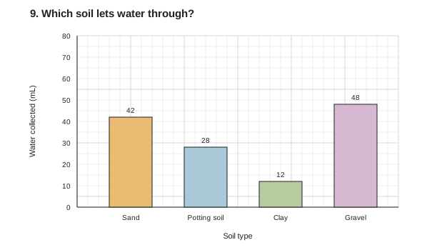
| Soil type | Water collected |
|---|---|
| Sand | 42 mL |
| Potting soil | 28 mL |
| Clay | 12 mL |
| Gravel | 48 mL |
Compare your reasoning
48 − 12 = 36 mL more. Gravel drained the most and clay the least in five minutes. Repeated trials would help check consistency.
Check your graph
Y: 0–80 mL, 5 mL per square; four equal-width category bars.
Start at zero. Keep bar widths and gaps equal. Include a title and units.
Your wording and prediction may differ. Other suitable even scales are welcome.
10. Which paper bridge holds the most?
Bar graph · How to make this graph
Sam builds four bridge designs using one sheet of the same paper for each and the same gap between supports. He adds identical coins until each bridge collapses. The last counts held before collapse are: flat, 6 coins; arch, 14 coins; accordion, 22 coins; and tube, 18 coins. Record each design and the number it held.
| Bridge design | Coins held |
|---|---|
Make your graph. Use a grid. Put bridge design on X and coins held on Y. Start the number scale at zero. Keep bar widths and gaps equal.
Calculate and explain. How many more coins did the accordion bridge hold than the flat bridge? Name one condition Sam kept the same to make the comparison fair.
Check your work — Problem 10
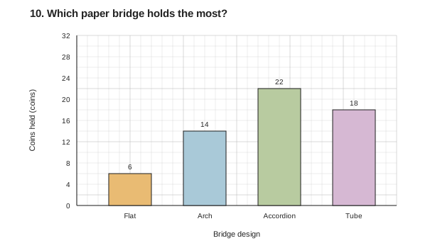
| Bridge design | Coins held |
|---|---|
| Flat | 6 coins |
| Arch | 14 coins |
| Accordion | 22 coins |
| Tube | 18 coins |
Compare your reasoning
22 − 6 = 16 coins. Same paper sheet, support gap or identical coins are acceptable controls.
Check your graph
Y: 0–32 coins, 2 coins per square; four equal-width category bars.
Start at zero. Keep bar widths and gaps equal. Include a title and units.
Your wording and prediction may differ. Other suitable even scales are welcome.
11. A puddle dries
Line graph · How to make this graph
A class models a puddle using a shallow tray of water. They measure the water remaining once each hour. At 0 hours there are 60 mL; at 1 hour, 52 mL; at 2 hours, 44 mL; at 3 hours, 38 mL; at 4 hours, 30 mL; and at 5 hours, 24 mL. Nobody adds or spills water. Organize the readings in time order.
| Time | Water remaining |
|---|---|
Make your graph. Use a grid. Put time on X and water remaining on Y. Label both axes with units, use even scales, and connect consecutive readings with straight segments.
Calculate and explain. How much water was lost in five hours? Was the loss the same every hour? Support your answer with two intervals.
Check your work — Problem 11
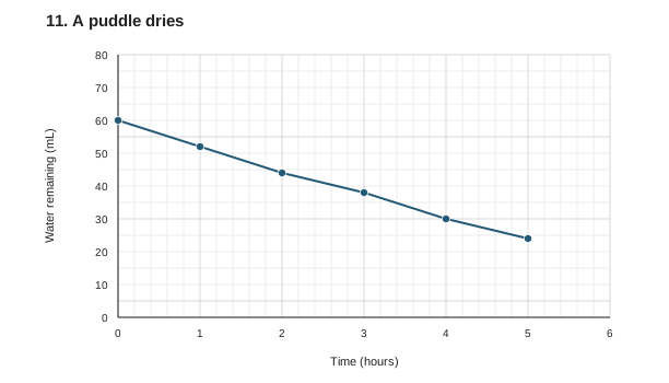
| Time | Water remaining |
|---|---|
| 0 hours | 60 mL |
| 1 hours | 52 mL |
| 2 hours | 44 mL |
| 3 hours | 38 mL |
| 4 hours | 30 mL |
| 5 hours | 24 mL |
Compare your reasoning
60 − 24 = 36 mL lost. Hourly losses: 8, 8, 6, 8, 6 mL, so the loss was not constant.
Check your graph
X: 0–6 hours, 0.2 hour per square; Y: 0–80 mL, 5 mL per square.
Connect neighboring points in time order. Include a title and units.
Your wording and prediction may differ. Other suitable even scales are welcome.
12. A solar oven warms up
Line graph · How to make this graph
A team places a small solar oven in sunlight and records its inside temperature. At 0 minutes it is 22 degrees Celsius; at 2 minutes, 28 degrees; at 4 minutes, 34 degrees; at 6 minutes, 38 degrees; at 8 minutes, 40 degrees; and at 10 minutes, 42 degrees. All temperatures are in degrees Celsius. Keep each time paired with its temperature.
| Time | Oven temperature |
|---|---|
Make your graph. Use a grid. Put time on X and temperature on Y, with units and even scales. Plot all six readings and connect them in time order.
Calculate and explain. What is the total temperature increase? Which two-minute intervals show the greatest increase?
Check your work — Problem 12
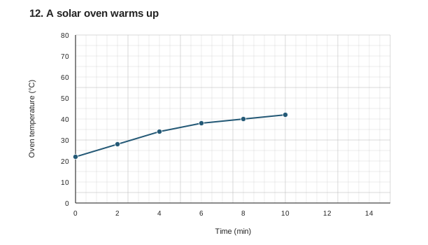
| Time | Oven temperature |
|---|---|
| 0 min | 22 °C |
| 2 min | 28 °C |
| 4 min | 34 °C |
| 6 min | 38 °C |
| 8 min | 40 °C |
| 10 min | 42 °C |
Compare your reasoning
42 − 22 = 20 degrees Celsius. Both 0–2 and 2–4 minutes increased by 6 degrees Celsius, the largest increases.
Check your graph
X: 0–15 min, 0.5 min per square; Y: 0–80 degrees Celsius, 5 degrees per square.
Connect neighboring points in time order. Include a title and units.
Your wording and prediction may differ. Other suitable even scales are welcome.
13. Light and seedling height
Scatter plot · How to make this graph
Six groups grow seedlings of the same species for two weeks. Each pair gives the daily hours of light and the final height: 2 hours and 4 cm; 3 hours and 6 cm; 4 hours and 7 cm; 5 hours and 10 cm; 6 hours and 9 cm; 7 hours and 12 cm. The groups may have watered differently. Keep each pair together.
| Daily light | Seedling height |
|---|---|
Make your graph. Use a grid. Put daily light on X and seedling height on Y. Include units, a title and even scales. Plot one dot per pair without joining the dots.
Calculate and explain. Describe the overall relationship and one exception. Does this comparison prove that light alone caused the height differences? Explain.
Check your work — Problem 13
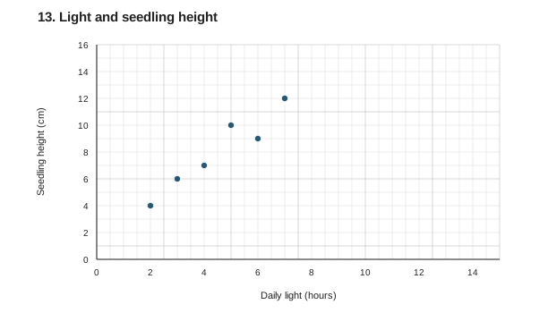
| Daily light | Seedling height |
|---|---|
| 2 hours | 4 cm |
| 3 hours | 6 cm |
| 4 hours | 7 cm |
| 5 hours | 10 cm |
| 6 hours | 9 cm |
| 7 hours | 12 cm |
Compare your reasoning
Height generally increases with light, but the 6-hour seedling is shorter than the 5-hour seedling. The comparison does not establish light as the sole cause because watering may differ.
Check your graph
X: 0–15 hours, 0.5 hour per square; Y: 0–16 cm, 1 cm per square.
Keep each pair together and leave the dots unconnected. Include a title and units.
Your wording and prediction may differ. Other suitable even scales are welcome.
14. Distance from a lamp and temperature
Scatter plot · How to make this graph
A class places six temperature sensors at different distances from a lamp and reads them after ten minutes. The paired results are: 5 cm and 38 degrees Celsius; 10 cm and 34 degrees; 15 cm and 31 degrees; 20 cm and 28 degrees; 25 cm and 29 degrees; 30 cm and 25 degrees. All temperatures are in degrees Celsius. Record each distance beside its temperature.
| Distance from lamp | Temperature |
|---|---|
Make your graph. Use a grid. Put distance on X and temperature on Y. Label units and use even scales. Draw six separate points; do not connect them.
Calculate and explain. How much cooler is the farthest sensor than the nearest one? Describe the overall trend and the pair that interrupts it.
Check your work — Problem 14
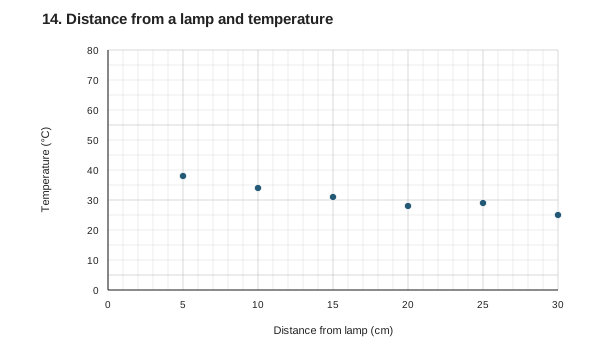
| Distance from lamp | Temperature |
|---|---|
| 5 cm | 38 °C |
| 10 cm | 34 °C |
| 15 cm | 31 °C |
| 20 cm | 28 °C |
| 25 cm | 29 °C |
| 30 cm | 25 °C |
Compare your reasoning
38 − 25 = 13 degrees Celsius cooler. Temperature generally decreases with distance, but it rises from 28 to 29 degrees between 20 and 25 cm.
Check your graph
X: 0–30 cm, 1 cm per square; Y: 0–80 degrees Celsius, 5 degrees per square.
Keep each pair together and leave the dots unconnected. Include a title and units.
Your wording and prediction may differ. Other suitable even scales are welcome.
15. Animals in the school garden
Pie graph · How to make this graph
During one garden survey, a class records exactly 50 animals: 24 ants, 12 beetles, 8 spiders, and 6 snails. Each animal is counted once in one group. Show how each group contributes to the whole survey. Fill in the count, percent share, spaces and total row.
| Animal group | Count | Share | Spaces |
|---|---|---|---|
| Total |
Make your graph. Use the first 50-dot circle. Percent = count ÷ 50 × 100. Spaces = percent ÷ 2. Count gaps clockwise and draw boundaries from the center. Add a title, category labels and percentages.
Calculate and explain. What percentage of the animals were beetles and spiders together? Check totals of 50 animals, 100% and 50 spaces.
Check your work — Problem 15
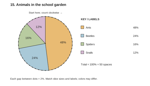
| Animal group | Count | Share | Spaces |
|---|---|---|---|
| Ants | 24 animals | 48% | 24 spaces |
| Beetles | 12 animals | 24% | 12 spaces |
| Spiders | 8 animals | 16% | 8 spaces |
| Snails | 6 animals | 12% | 6 spaces |
| Total | 50 animals | 100% | 50 spaces |
Compare your reasoning
(12 + 8) ÷ 50 × 100 = 40%. Shares: 48%, 24%, 16%, 12%; spaces: 24, 12, 8, 6. Totals: 50 animals, 100%, 50 spaces.
Check your graph
Starting at the top, boundaries after 24, 36, 44 and 50 spaces.
Count gaps, not dots. Check totals of 100% and 50 spaces. Include a title and units.
Your wording and prediction may differ. Other suitable even scales are welcome.
16. Materials in a classroom supply box
Pie graph · How to make this graph
A class sorts exactly 100 items from a supply box by their main material. There are 36 paper items, 28 plastic items, 24 wooden items and 12 metal items. Each item appears in only one category. Fill the table to show the share of the whole box for each material, including the total row.
| Material | Count | Share | Spaces |
|---|---|---|---|
| Total |
Make your graph. Use the second 50-dot circle. Percent = count ÷ 100 × 100. Spaces = percent ÷ 2. Count gaps, not dots, and draw each boundary from the center. Label categories and percentages.
Calculate and explain. How many percentage points larger is paper’s share than metal’s share? Check totals of 100 items, 100% and 50 spaces.
Check your work — Problem 16
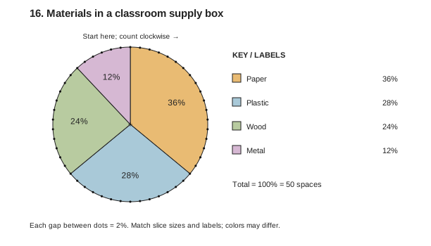
| Material | Count | Share | Spaces |
|---|---|---|---|
| Paper | 36 items | 36% | 18 spaces |
| Plastic | 28 items | 28% | 14 spaces |
| Wood | 24 items | 24% | 12 spaces |
| Metal | 12 items | 12% | 6 spaces |
| Total | 100 items | 100% | 50 spaces |
Compare your reasoning
36 − 12 = 24 percentage points. Shares: 36%, 28%, 24%, 12%; spaces: 18, 14, 12, 6. Totals: 100 items, 100%, 50 spaces.
Check your graph
Starting at the top, boundaries after 18, 32, 44 and 50 spaces.
Count gaps, not dots. Check totals of 100% and 50 spaces. Include a title and units.
Your wording and prediction may differ. Other suitable even scales are welcome.